Interaction Plot
tags: #statistics/inferential/anova/two_way
We can visualize the joint effect of two categorical predictors on a quantitative continuous DV using interaction plots.
How do we plot interaction plots?
x-axis- displays ALL levels of factor A (IV) - generally, the factor with more levelsy-axis- displays the scale for continuous quantitative DVLines- a line is plotted on the graph for each level of factor B (IV)
Example:
Here we are showing the effect of dosage (FACTOR A) on males vs females (FACTOR B), where y is the measure of the efficacy of the drug dosage:
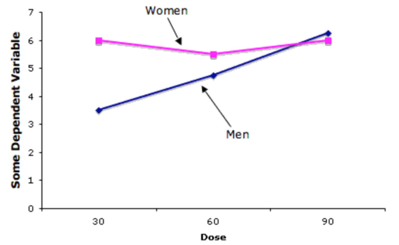
How can we interpret this?
-
We can see that, while holding dosage constant at 30, we can see that the efficacy of the drug is more effective among women than men.
-
However, the opposite is true, when dosage is high, where we see the efficacy of the drug for women go down, while the effectiveness of the drug goes up among males.
Interaction Plots in Python
To create an interaction plot for a two-way ANOVAin Python, you can use the interaction_plot function from the statsmodels.graphics.factorplots module:
Import libraries
import matplotlib.pyplot as plt
from statsmodels.graphics.factorplots import interaction_plot
Plot Interaction After Running ANOVA
# create the interaction plot
fig, ax = plt.subplots(figsize=(8, 6))
interaction_plot(x=data['Factor1'],
                 trace=data['Factor2'],
                 response=data['DV'],
                 colors=['red', 'blue'],
                 markers=['D', '^'],
                 markersize=10,
                 ax=ax)
ax.set_xlabel('Factor 1')
ax.set_ylabel('DV')
ax.set_title('Interaction Plot')
plt.show()